New York Road Runners
To help and inspire people through running
New York Road Runners is a mission-based not for profit renowned for hosting the New York City marathon. Less known is that each year, NYRR serves nearly 600,000 runners of all ages and abilities through hundreds of races, community open runs, walks, training sessions, and other running-related programming.
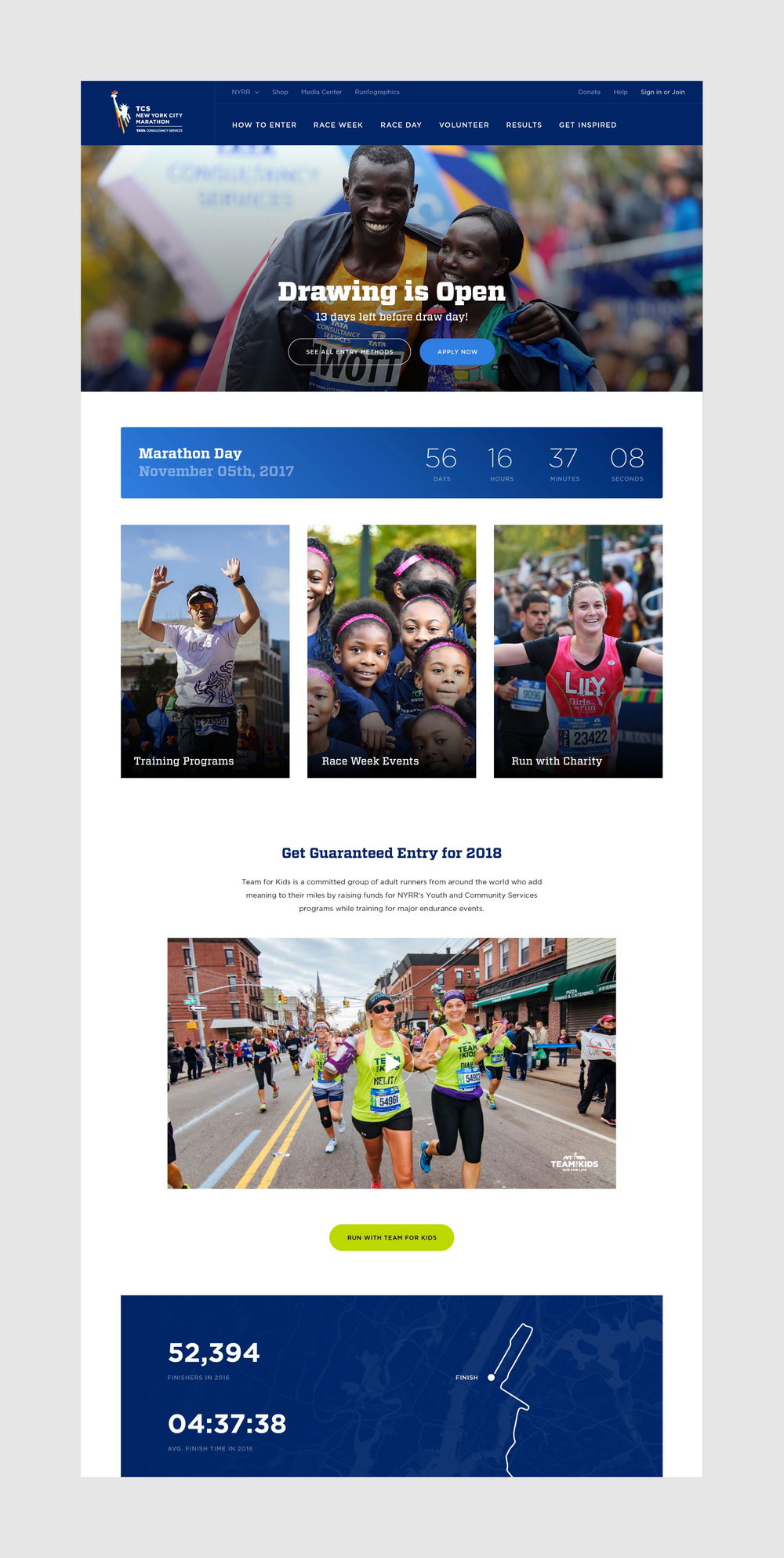
To expose these programs, we advanced and aligned the NYRR brand across a dozen separate digital properties and created a unified site that encourages running enthusiasts while expanding essential tools for engaged members.
The new site is packed with features engineered to improve the user experience for all visitors — a platform that better serves the NYRR community, and furthers their mission to help and inspire people through running.
Our objective with the redesign was to increase the exposure of NYRR’s full line of programming without diluting the existing audience for any individual offering — as each program presents an opportunity to connect with runners.
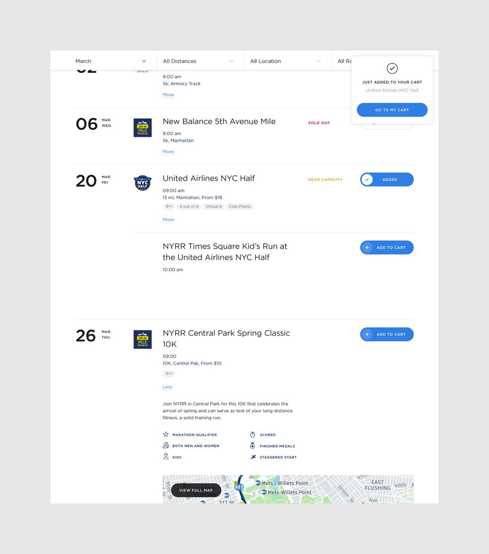
A brand new events calendar was central to our approach, surfacing at a glance a timely view of everything NYRR has to offer their community, including training programs, fitness classes, youth events, volunteer opportunities, races and more.
At the same time, we balanced the broad view with advanced filtering that allows visitors to quickly narrow the calendar results to find exactly what they are looking for, whether by date, category, distance, location, or type of race.
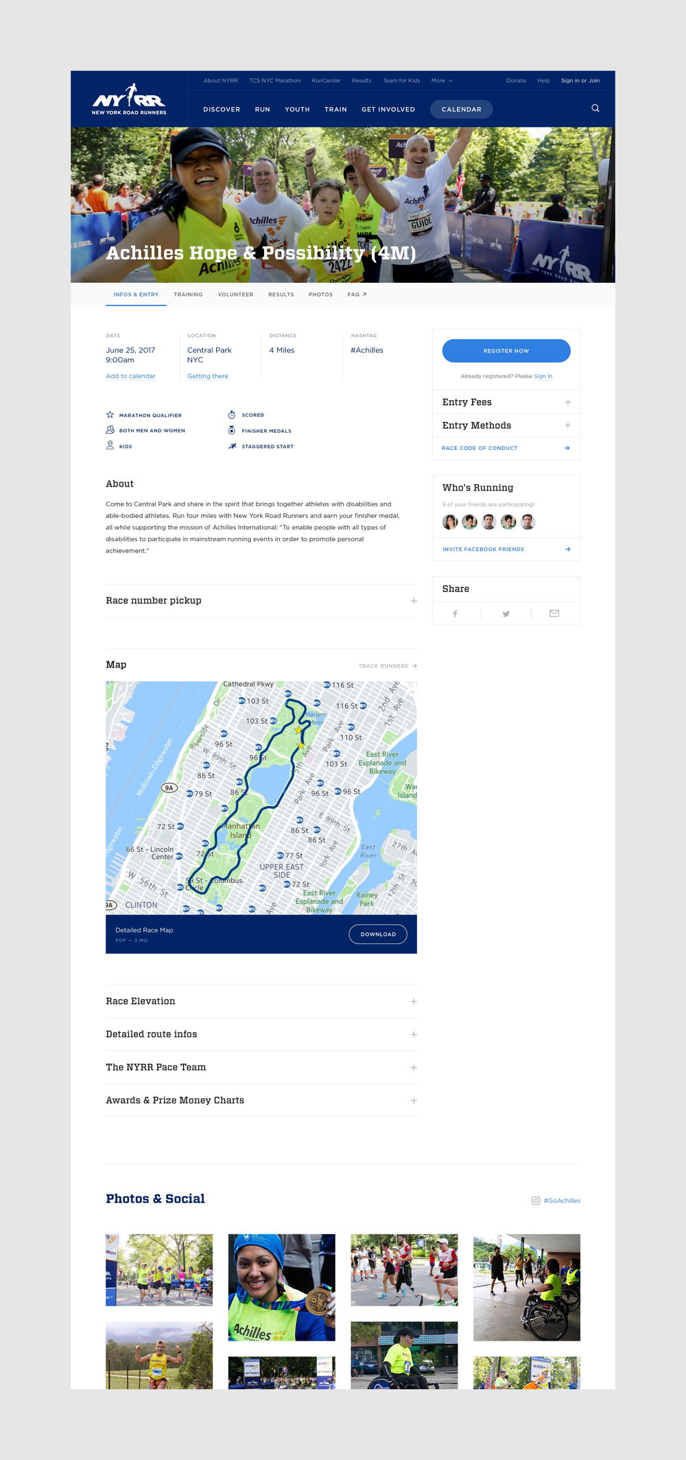
Serving upwards of one hundred races each year, for participants of all ages and fitness levels, race detail pages are another key component of the new site. A flexible template provides practical race details before the event as well as generating excitement for upcoming races. These pages provide must-know event details during race day, and after the event it’s updated with final results and photographs to relive the experience.
For each race page, we created alternate pathways that guide visitors to connect with the wider NYYR community through social media and to further explore other races and events from the NYRR ecosystem.
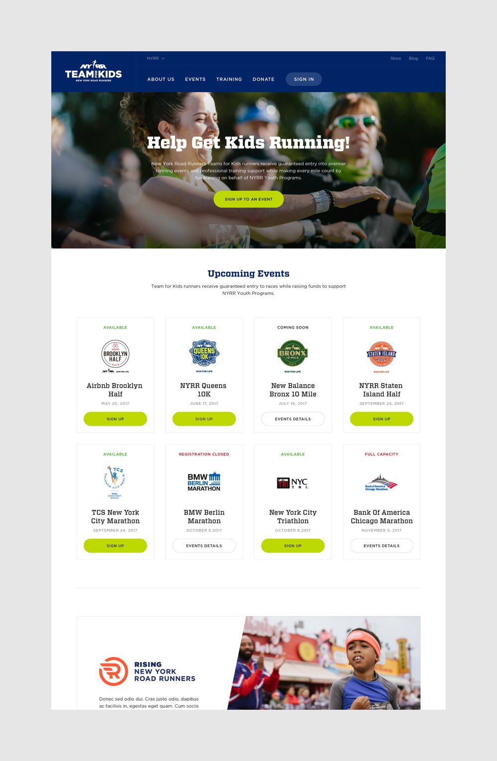
Across the site we streamlined the navigation, reducing the number of steps it takes for visitors to find and act on key information. To promote NYRR’s primary offerings, we simplified the information architecture, and re-introduced core programs within various pages for visitors to take action. Users can register for adult races and free Rising New York Road Runners youth races from multiple locations across the site or they can register to volunteer from the main calendar, the individual race/volunteer pages or directly from featured in-page modules.
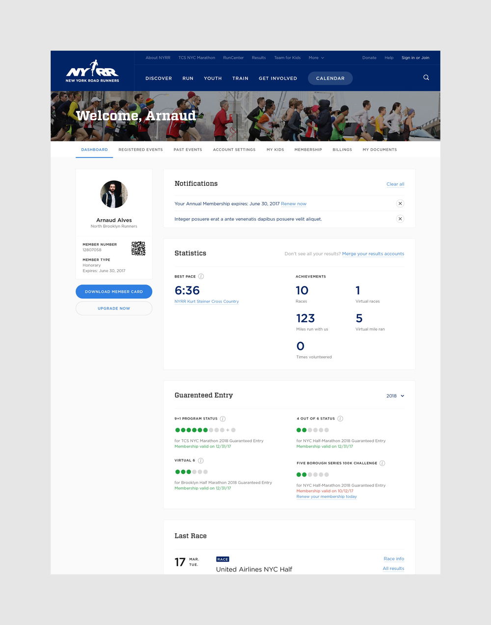
Beyond intuitive navigation and a compelling visual design, users can create and manage their own profile. Signing into their NYRR account, members can access a personalized dashboard to easily manage their profile, races they have registered for, events they may be interested in, 9+1 status, membership, billing options, and more. By allowing each user to deepen and personalize their individual experience with the platform, we also strengthen their involvement as a member of the NYRR running community.
The new site unifies 13 web products and third-party apps into a cohesive ecosystem. It was paramount that the redesigned interface offer consistency across the design system, holding everything together while allowing individual brands to shine through and retain their spirit.
For programs that had previously been under-represented, such as the Youth program, we created a dedicated space in the new site, which now contains information on free youth races, training resources, and initiatives such as 1 for You 1 for Youth and Run for the Future.
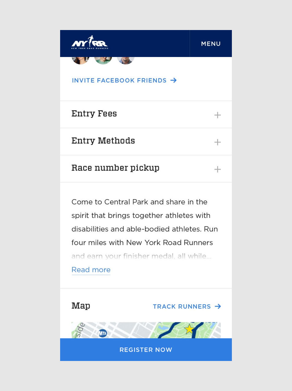
NYRR seeks to inspire all people through running, regardless of age, means, or ability, and irrespective of achievement. For this reason, accessibility was at the core of the redesign across all devices, employing best practices through design and development. The site offers the option for individual visitors to further increase the contrast of the design, making the product usable by people with the widest range of abilities, operating within the widest range of situations. We optimized the design for on-the-go use-cases, ensuring that the mobile and tablet experience was as delightful as the desktop one.
“Each AREA 17 team member brought strong thought leadership, expertise, and patience along every step of the project.” — Jill Joyner, Director, Product Management