 Translation
Translation
2018
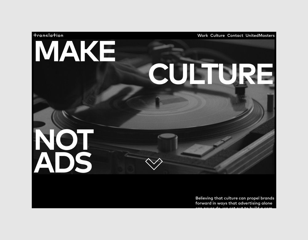
Make culture not ads
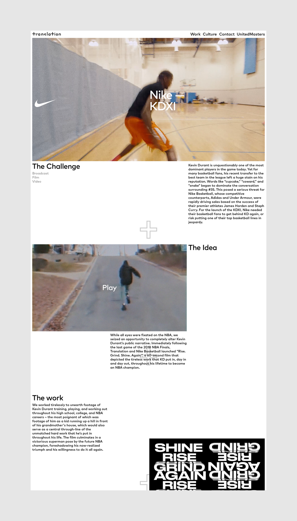
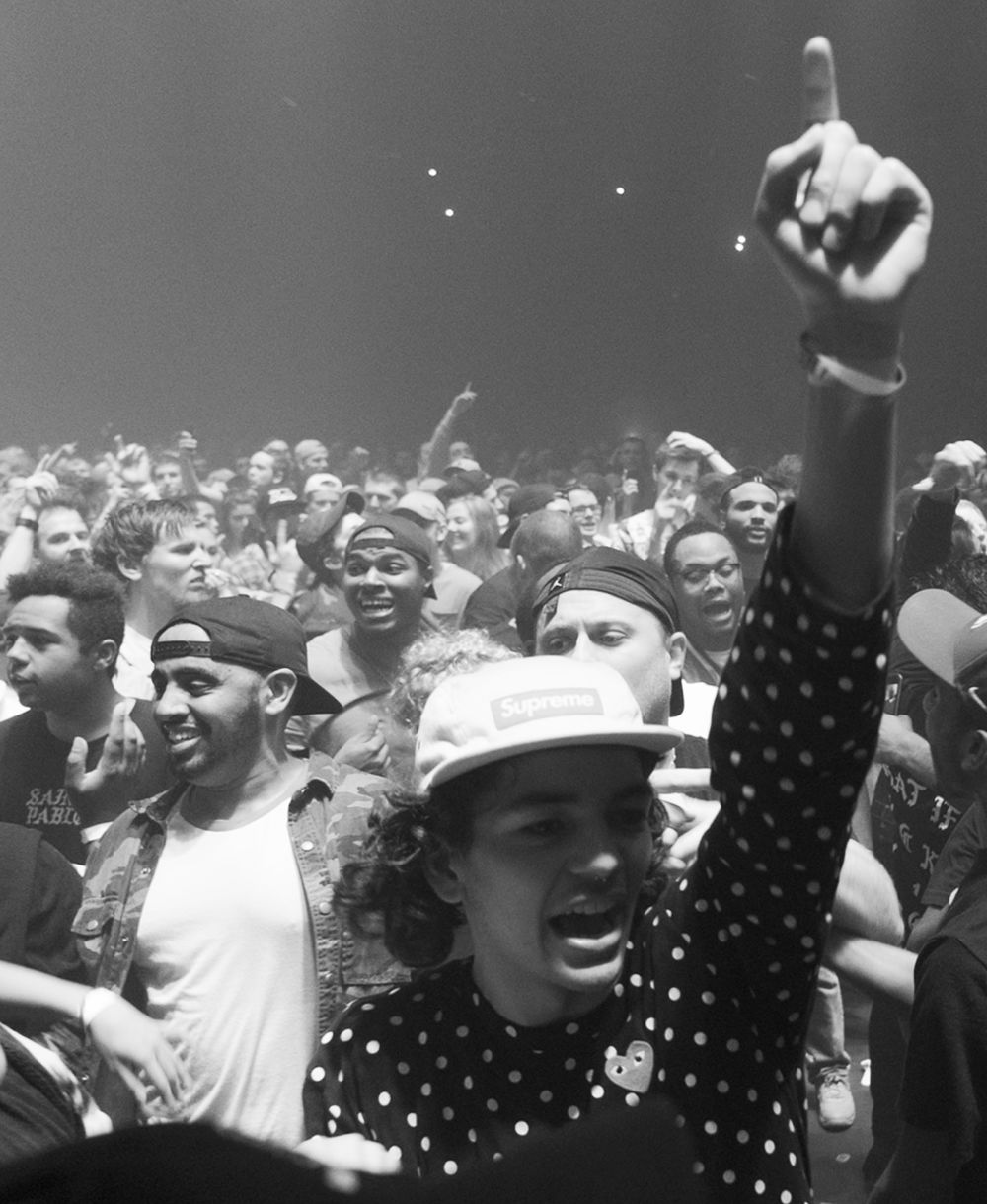
Translation is an independent agency that mixes its deep roots in the music, sports and fashion industries with a passion for culture, technology and storytelling to offer value to clients beyond traditional advertising. Rejecting the ad industry technique of dividing consumers into segments and highlighting differences, Translation carved out a niche for itself by forging a unique company ethos focused on tapping cultural trends to bring people together. Innovative projects like feature-length films, one of the biggest music festivals in America, network TV shows and its own line of Air Jordans have helped Translation win key accounts like Bud Light and the NBA and led Ad Age to name Translation an “A-List” agency for 2018.
Fresh off a rebranding, the company needed a partner that could convert its cultural fluency and urban-inspired aesthetic into an on-brand and performant digital storytelling platform. Taking its saucy, newly created identity as the starting point, AREA 17 designed and developed a digital experience as unique as the company itself; one that allows it to flaunt its progressive ethos while showcasing its people as keen purveyors of culture.
Post launch, engagement has soared, with the site attracting 48% more users and 47% more sessions per month. The community has responding tremendously with referral traffic growing a whopping 1,433%. Performance has increased sharply with average page load time decreasing by 27%. Translation was named Awwwards’ Site of the Day on December 1, 2018 and was nominated for Developer Site of the Year for 2018.
The site is made with Twill, our open source CMS for Laravel.
- Experience
- Experience vision and strategy
- Concepting and prototyping
- Experience design
- Design systems
- Technology
- Technology strategy and architecture
- Custom application development
- Custom interface development
Up next
-

OXMAN
2022–2024
System-level change through nature-centric design
-

ElevenLabs
2023–2024
Scaling a research start-up into the leading AI audio platform