Precision Run
Run, rebel, run
Created by running specialist David Siik, Precision Run is a unique indoor running program on a mission to redefine how runners — and haters — think about treadmill training. The program’s groundbreaking method uses interval training to tailor each class to the individual runner no matter what their level. In their dedicated studios, oxygen-enriched air, light and music cues that guide each run and advanced treadmills are just the beginning for this running revolution.
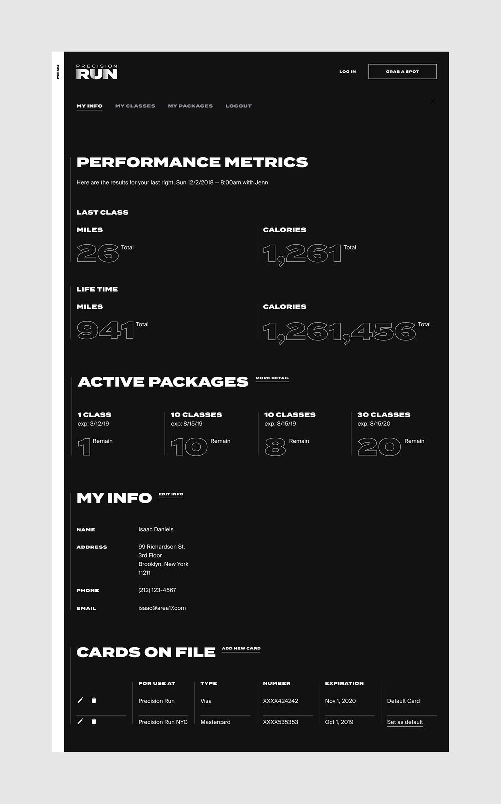
AREA 17 created a website and native mobile app that seamlessly integrate with the program’s precision software, and sit at the hub of the Precision Run experience — from learning about the method and booking a class with the right coach to analyzing performance data and sharing it with friends on social media.
Precision Run was named Awwwards’ Site of the Day on June 22, 2019.
Running can be intimidating. That’s why Precision Run was created: to make the benefits of indoor running accessible to avid runners and would-be, wanna-be, not-sure-if-I’m-ready-for-it runners alike. The website introduces prospective runners to the First Run experience step by step and includes testimonials and frequently asked questions to remove any barriers to attending the first class.
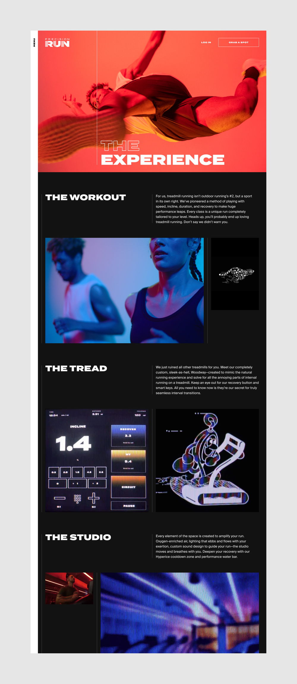
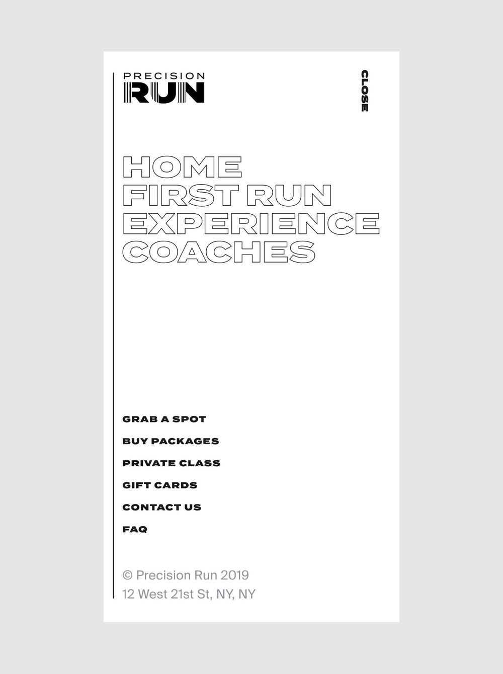
To reflect the revolutionary positioning of the Precision Run method and brand, we designed an energetic digital experience through a bold combination of typography, imagery and page transitions. We created an immersive navigation system and a dynamic page layout that is enhanced by the playful characters and inspiring kinetic manifesto photography and films created by Hugo and Marie.
On the Experience section, runners can learn more about the first-of-its-kind running method, the exclusive sleek-as-hell treadmill built to mimic the natural running experience and how to deepen their recovery with the Hyperice Cooldown Zone and Hydro Bar stocked with performance drinks in their studio.
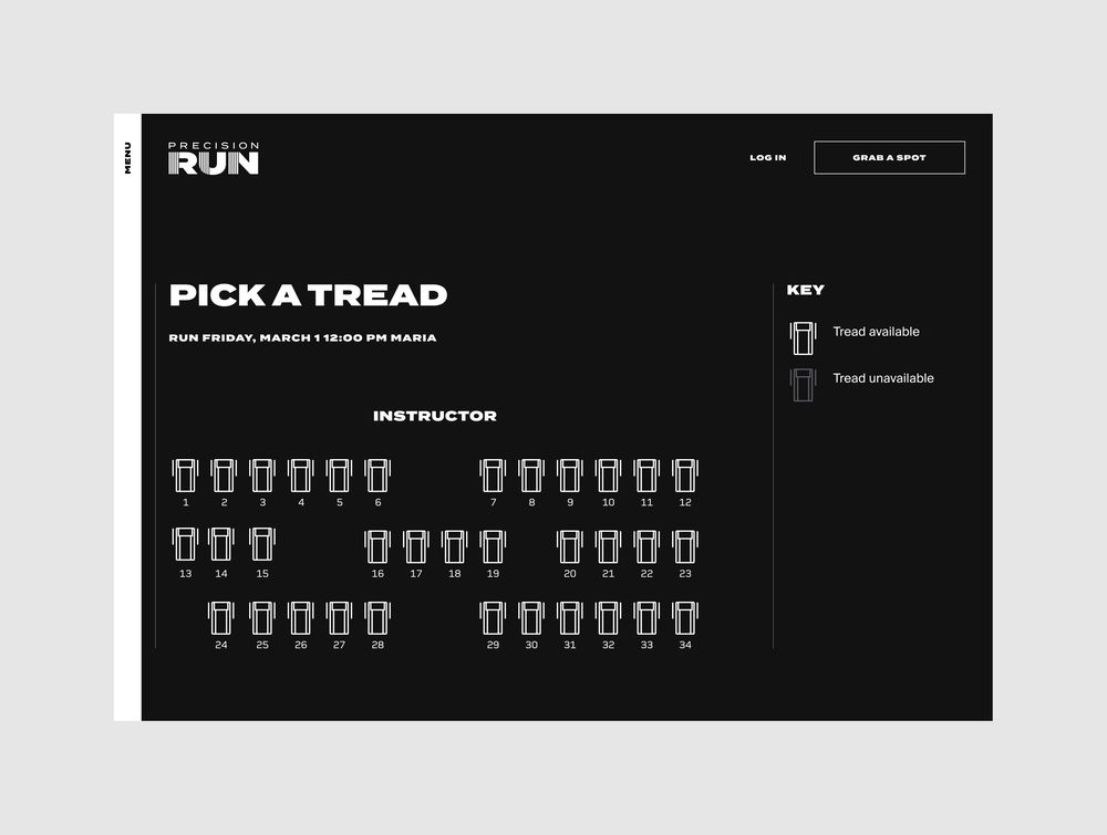
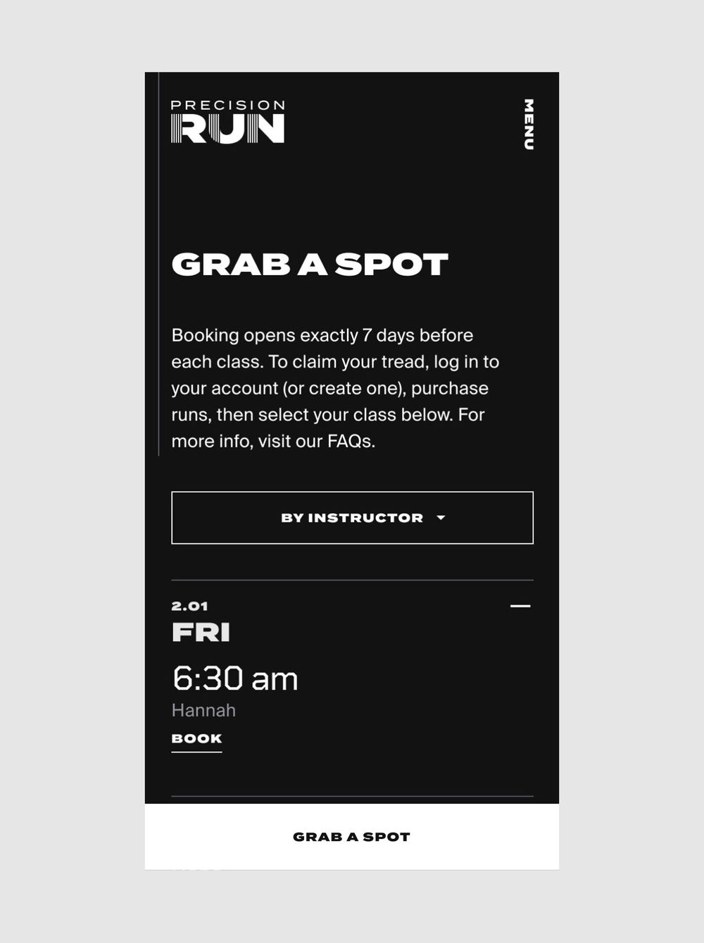
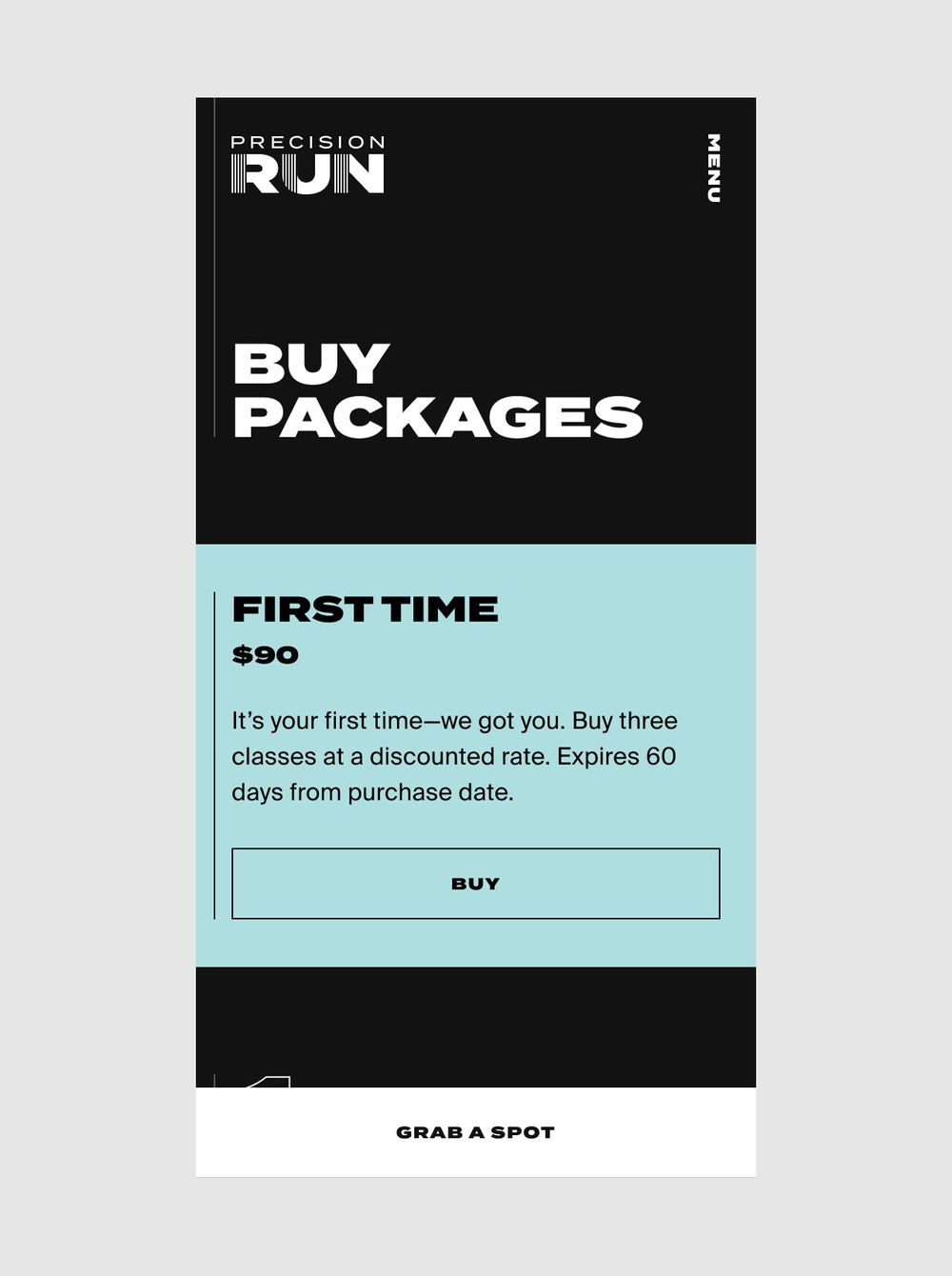
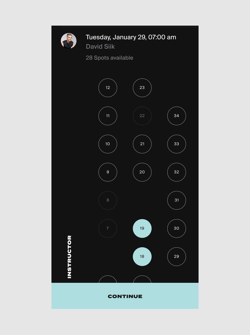
Beyond elevating Precision Run and telling the brand story, the web and the app design had very functional goals. Making it easy to get to a Precision Run class was given top priority during the UX design phase. Persistent “Grab a Spot” calls-to-action on mobile keeps booking a class just one click away during the whole experience.
On the Coaches page, runners can learn more about their favorite coaches, their mantras and filter the schedule with ease to run a class with them.
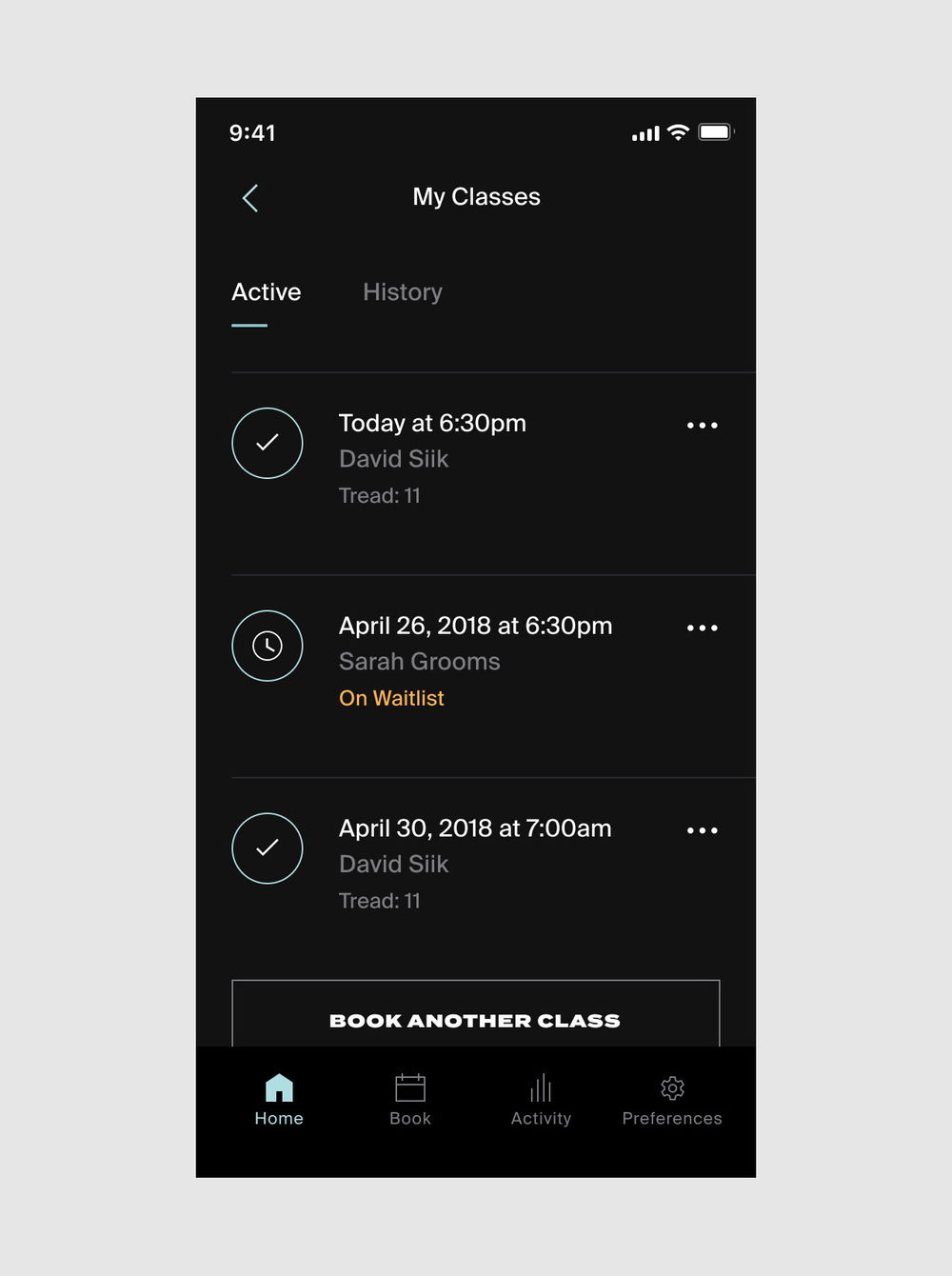
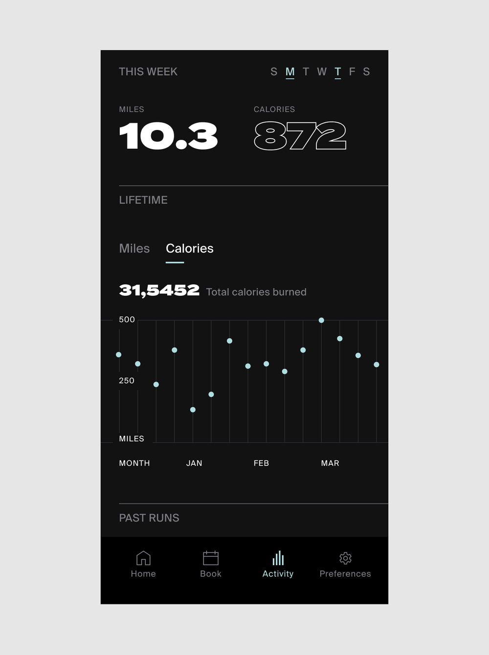
As a second step of the Precision Run omni-channel, we launched the Precision Run native app for iPhone and Android. Beyond extending the website functionalities, the app is at the center of the Precision Run experience, capturing and visualizing the personal running data that drives the “precision” aspect of the program. It also allows runners to easily check in the studio and share their latest runs on Instagram stories.