Fondation Louis Vuitton
A novel experience of art and architecture
The Fondation Louis Vuitton welcomes more than a million visitors each year to experience modern and contemporary art and architecture in new ways.
From offering tours of the Frank Gehry-designed building to presenting exhibitions and events across the cultural spectrum, the Fondation works to make art and culture accessible to all. Yet the website created barriers for users to fully understand and benefit from this offer.
The Fondation partnered with AREA 17 to replatform to Twill, our open source CMS for Laravel, and to consolidate communications, sales, and the Collection into a seamless digital product that delivers on the museum’s promise of a unique, high-quality experience.
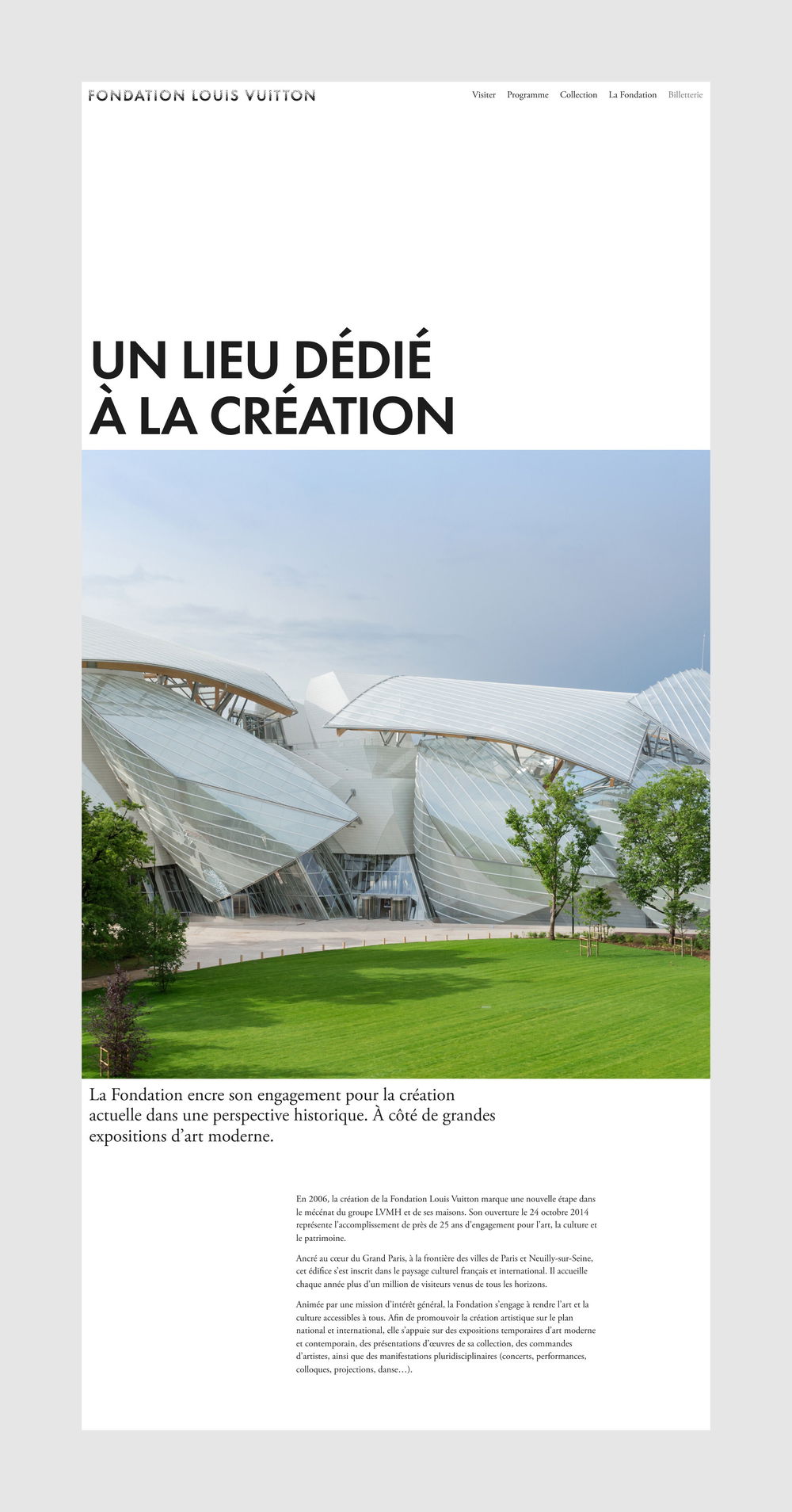
The Fondation was borne of a bold vision—to create a new cultural landmark in a landscape rich with cultural institutions. This audacious spirit and desire to innovate, reflected in the building’s architecture, are carried through in our design system.
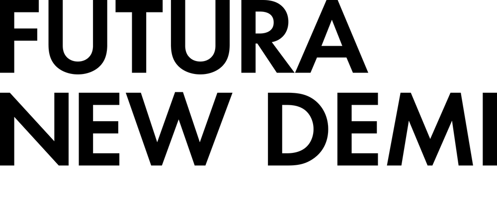
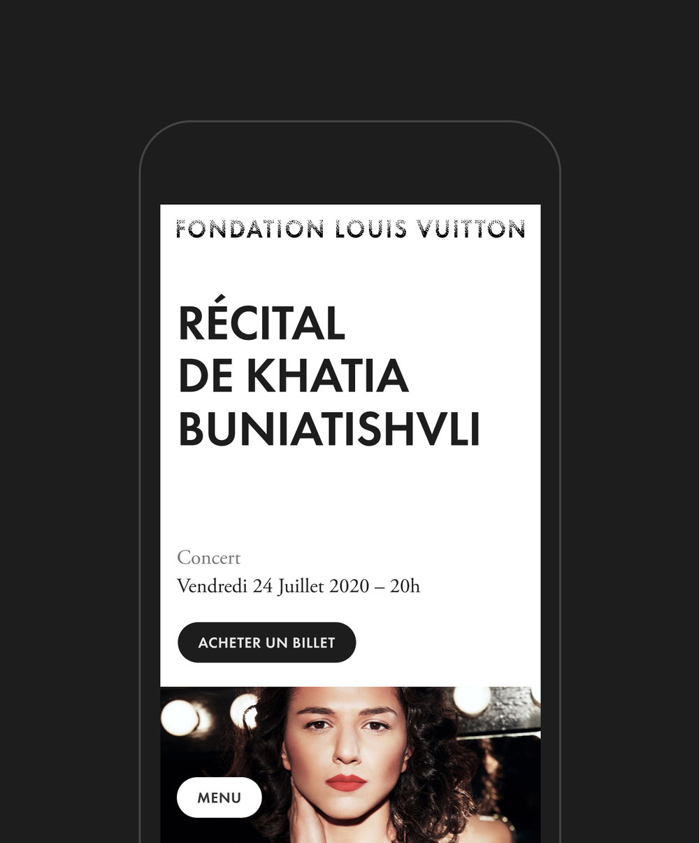
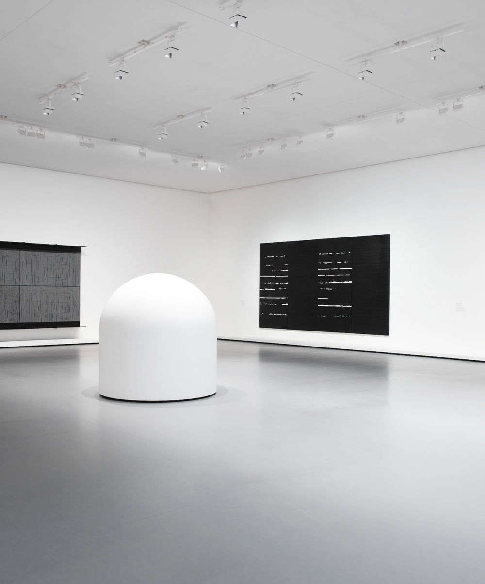
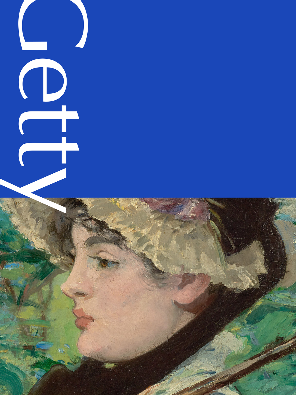
Bold applications of the logo and Futura New Demi type are paired with generous white space that recreates the gallery environment and brings prominence to the artworks. The resulting design demonstrates the sophistication of Louis Vuitton and the democratic nature of a public service institution.
Communications and online sales were split across two platforms whose complexity prevented internal teams from working autonomously and focusing on growth. By moving to a single Twill-based platform and global design system, we empowered administrators to manage content and products with ease. Editors can select from small, medium, and large Event page types that clarify scale and support different visual formats for a flexible but consistent output..
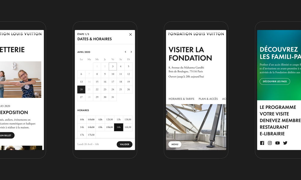
Users benefit from a seamless interaction with the Fondation, from exploration to purchase to preparing their visit, that makes it easy to participate in programming and take advantage of valuable, lesser known services. On Event pages, ticket purchase is integrated using a simple checkout path that helps users quickly accomplish their goal; and complimentary services like micro-visits and digital tools are given dedicated space.
Our work to integrate sales not only focused on conversion but on appealing to diverse audiences by clarifying the range of programming and services available. The Programme design creates hierarchy to serve the most common use case (buy an exhibition ticket) while bringing visibility to the unique tours and workshops surrounding the exhibition. Dedicated visit pages for Families and School groups feature relevant events, and improved contact forms streamline the visit planning process.
Through the Collection’s digital counterpart, users can (re)discover all of the artworks unveiled since the opening of the Fondation. We wanted to give the Collection a more prominent place in the overall user experience, enhancing site-wide engagement beyond the programme and practical information. By designing more engaging pages for artists and artworks, and by providing more interaction and links between content, the experience guides and encourages the discovery of this exceptional contemporary art collection in the making.