Pentagram
A new home for design
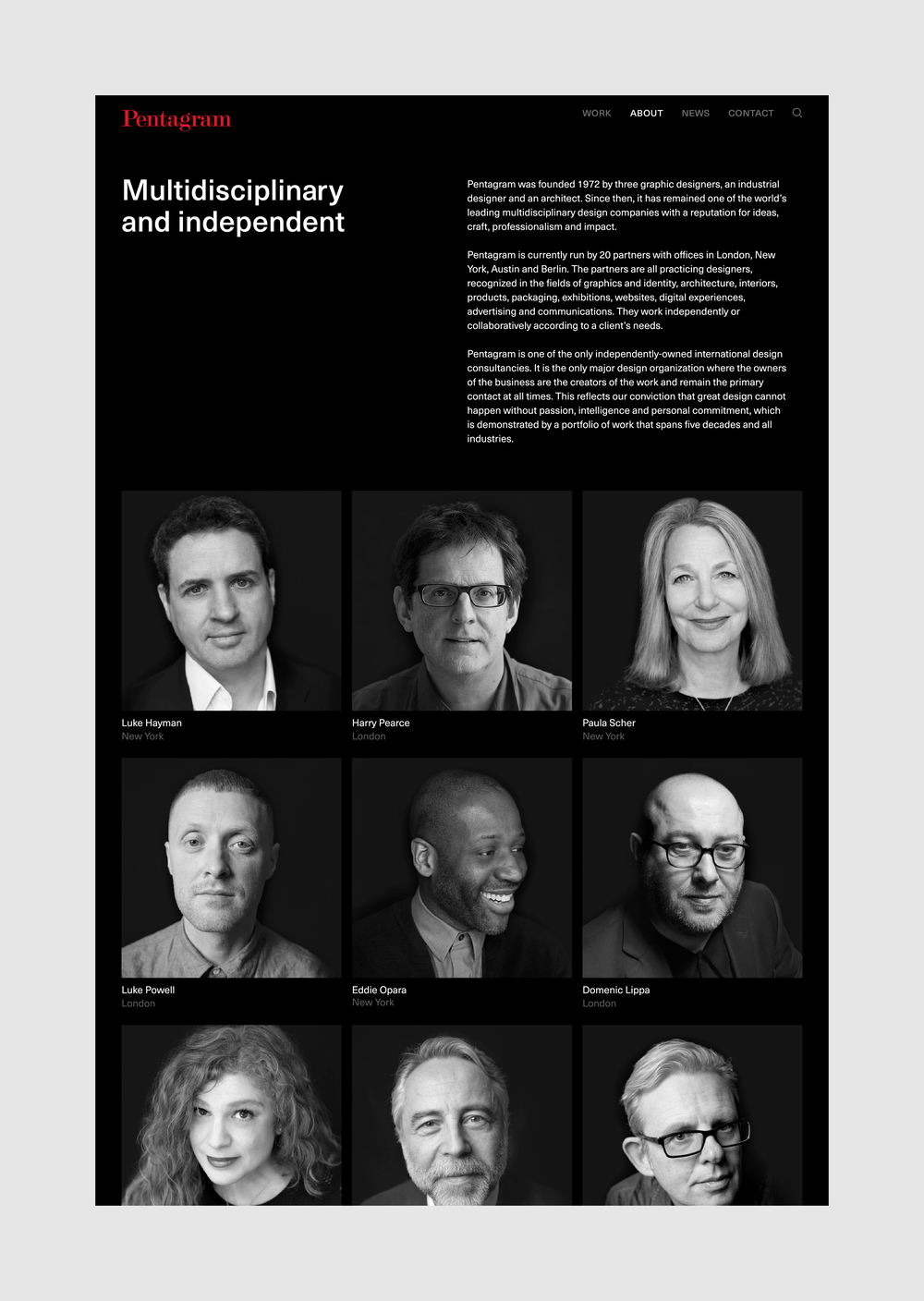
As the world’s largest independently owned design firm, Pentagram needs little introduction. Working across a broad spectrum of clients, Pentagram design is woven into the fabric of our culture and ubiquitous in our daily lives.
Having enjoyed a long partnership with the firm, beginning with the website redesign for Adweek in 2011 and continuing through the years on projects that include Billboard Magazine, Library of America and Charlie Rose, we felt uniquely positioned to elevate the firm’s website to meet their own high standard of design and performance.
“As a consultant myself, I can’t imagine a worse client than one with 20 equal owners, each of whom is opinionated and strong-minded. AREA 17 not only did a great job on our site, but structured a process that led to interesting discussions, clear decisions, and a result that we can claim as the best expression of our thinking and work.” — Michael Bierut
Pentagram is made with Twill, our open-source CMS for Laravel.
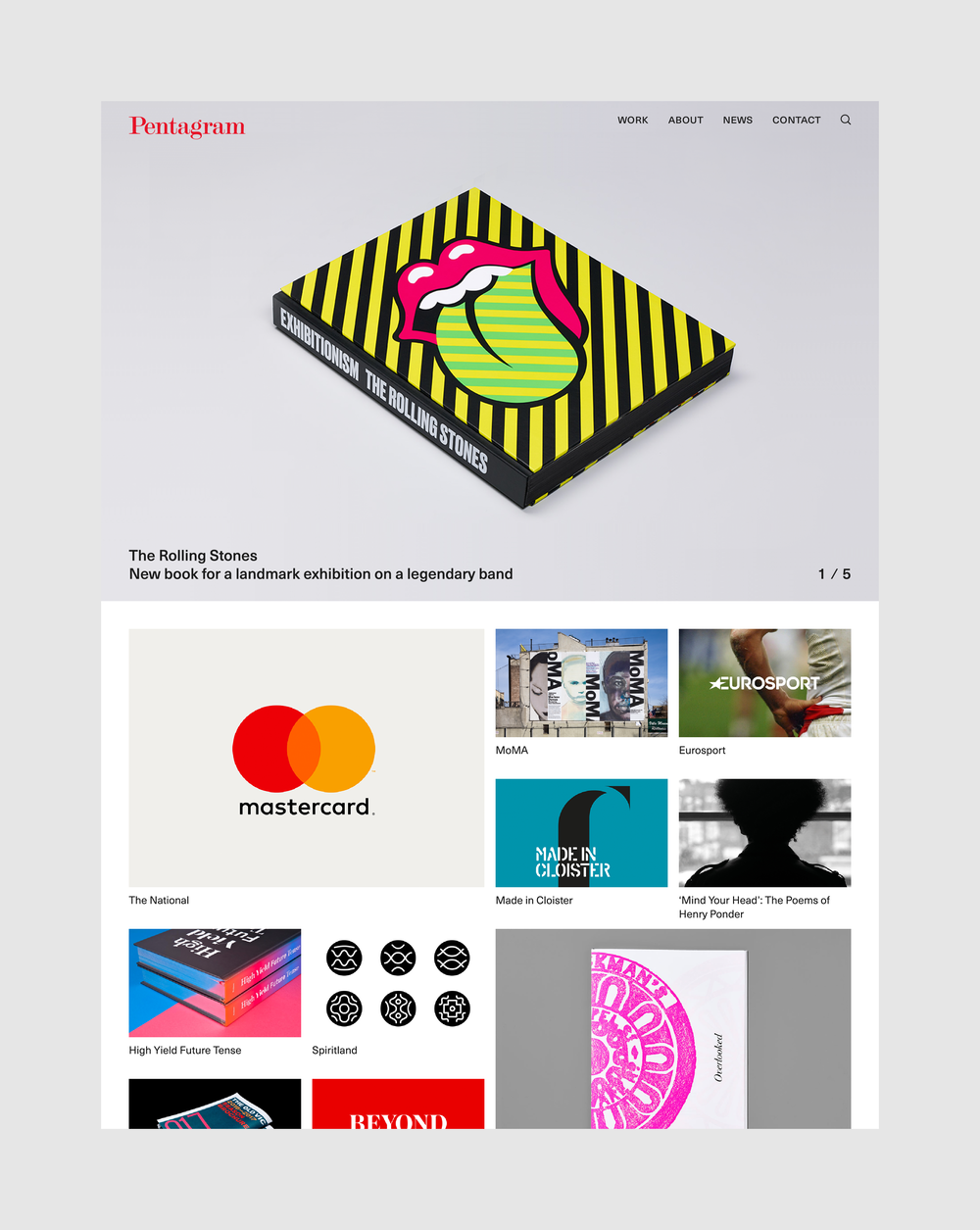
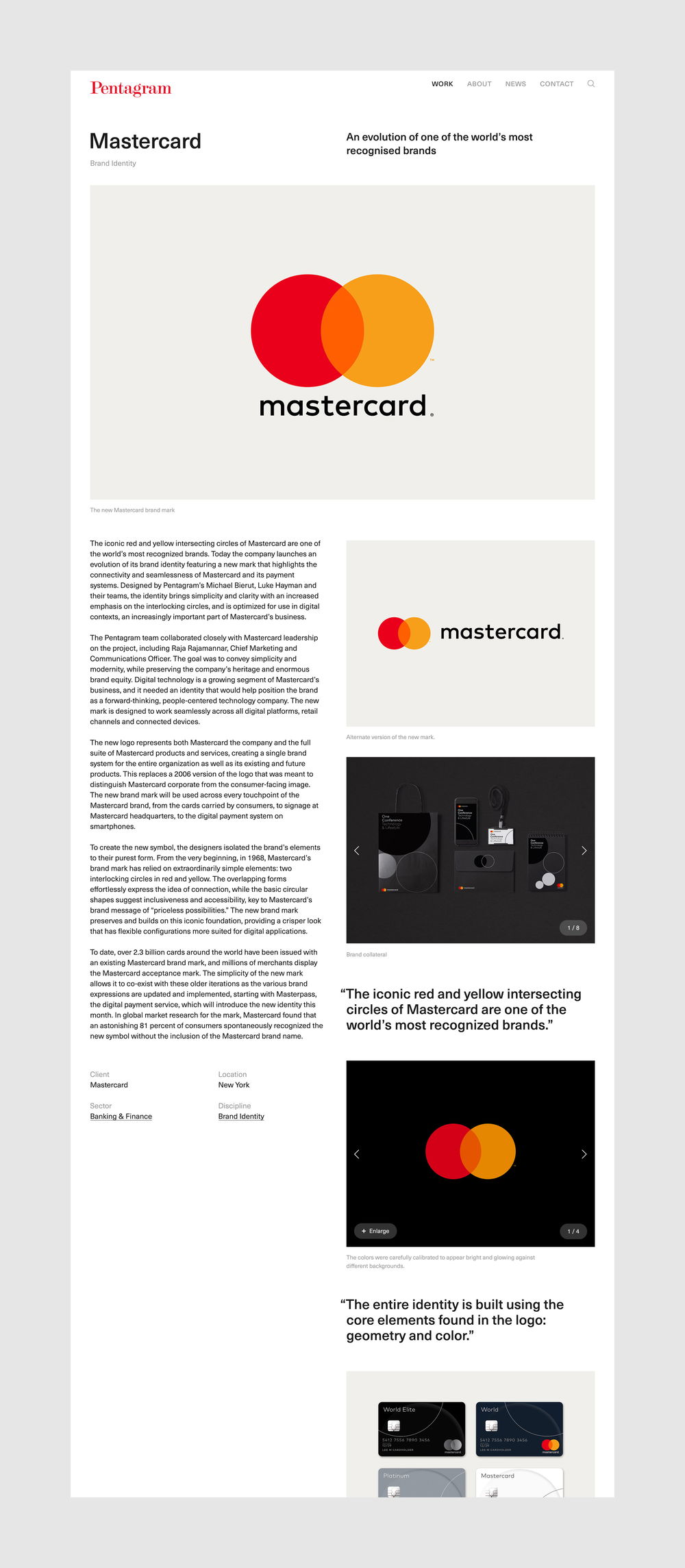
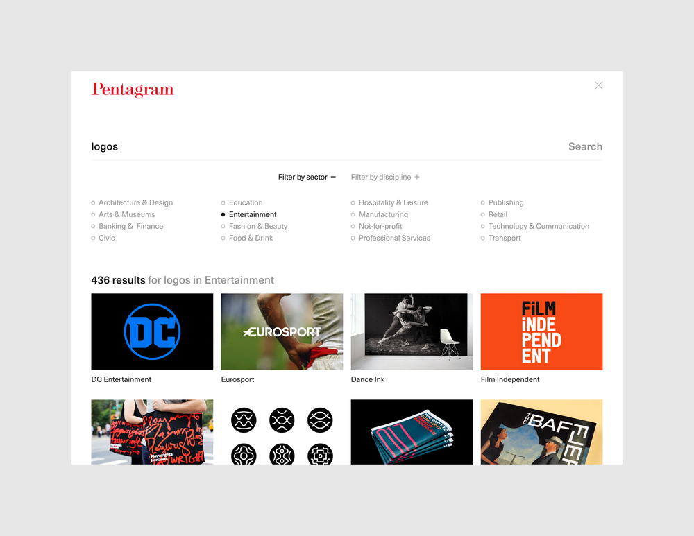
Our approach focused on consolidating information into fewer entry points, providing more context and curation throughout and designing a browse and search experience that makes it easy to find and discover relevant work from within the firm’s expansive portfolio. Befitting the values of the firm, the work comes first and the visual design and information architecture aim to elevate the firm’s output. Functionally-focused, elegant animations provide hints on where to go next—making both navigating the site and browsing the work effortless and enjoyable.
With an archive of nearly 1000 projects across a range of disciplines, it was crucial that the CMS allows partners to easily customize each case study. Using Twill, our CMS for Laravel, we created a modular system with fixed and flowing underlying grids so that individual projects can be optimized for the visuals that are best suited to it.
Visually-driven, all case study images open into a full-screen slideshow and for select projects, a secondary “story” view splits the screen into an independent narrative and image panels.
We wanted an archive that provided many entryways and which was fun to browse. The work section of the website is organized primarily by type of client and type of project with an alternate listing of everything. Sliding between views, each has a slightly different grid and function, reinforcing the different lenses through which work can be explored.
Leaving nothing to chance, a powerful search that cleverly slides over the currently visible page is accessible throughout.
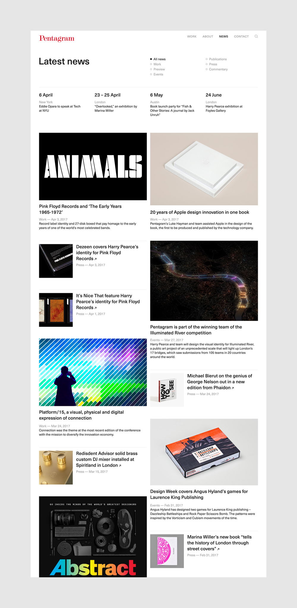
Not only is the website a showcase for Pentagram’s prolific output, but a hub for all of their rich contributions to the industry. Champions of design, the website includes a stream of regular columns, speaking engagements and podcasts.
“AREA 17 not only did a great job on our site, but structured a process that led to interesting discussions, clear decisions, and a result that we can claim as the best expression of our thinking and work.” — Michael Bierut