New England Journal of Medicine
200 years of medical breakthroughs
The New England Journal of Medicine (NEJM) began publishing in 1812. In 1996, they began publishing medical research online. Two decades into their pioneering embrace of digital publishing, they approached AREA 17 to reimagine their online presence.
This being NEJM, we began with data and analytics. Our discovery process included gathering data about usage, navigation, demographics, entry and exit points. We then built prototypes in our architecture phase to gain insights on our hypotheses before moving into design.
Based on our discoveries, we polished a reading experience that involves myriad components to satisfy academic specifications; enhanced a search function that combs more than 200 years of archives; designed a navigation that serves daily browsers and focused researchers; and created a new experience that unifies learning content.
The resulting platform revitalizes an essential medical resource, turning it into a focused tool that serves users throughout their medical careers.
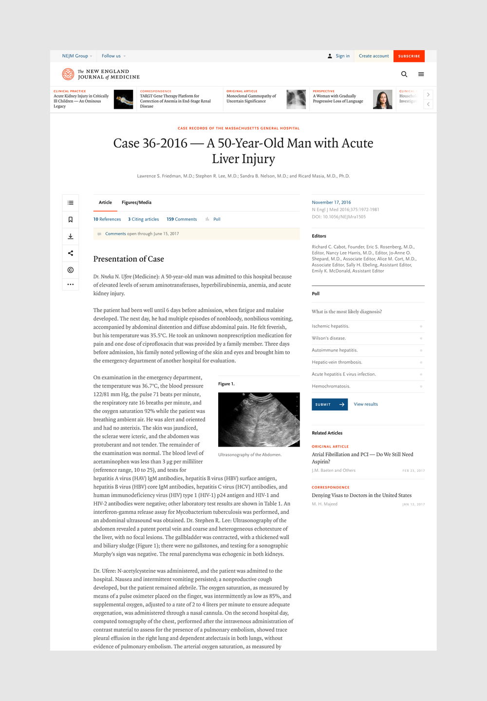
High search rank and prominence in research aggregators means users’ sessions at NEJM.org often begin with a direct link to an article page. In this academic context, longer-read articles with several appendices are the norm.
With that in mind, we designed the article pages as the foundation of the experience, including a suite of tools that give the user deep control over content on mobile and desktop. Our final product provides immersion with the content without sacrificing confidence that the features users need to digest charts and bookmark research are at their fingertips.
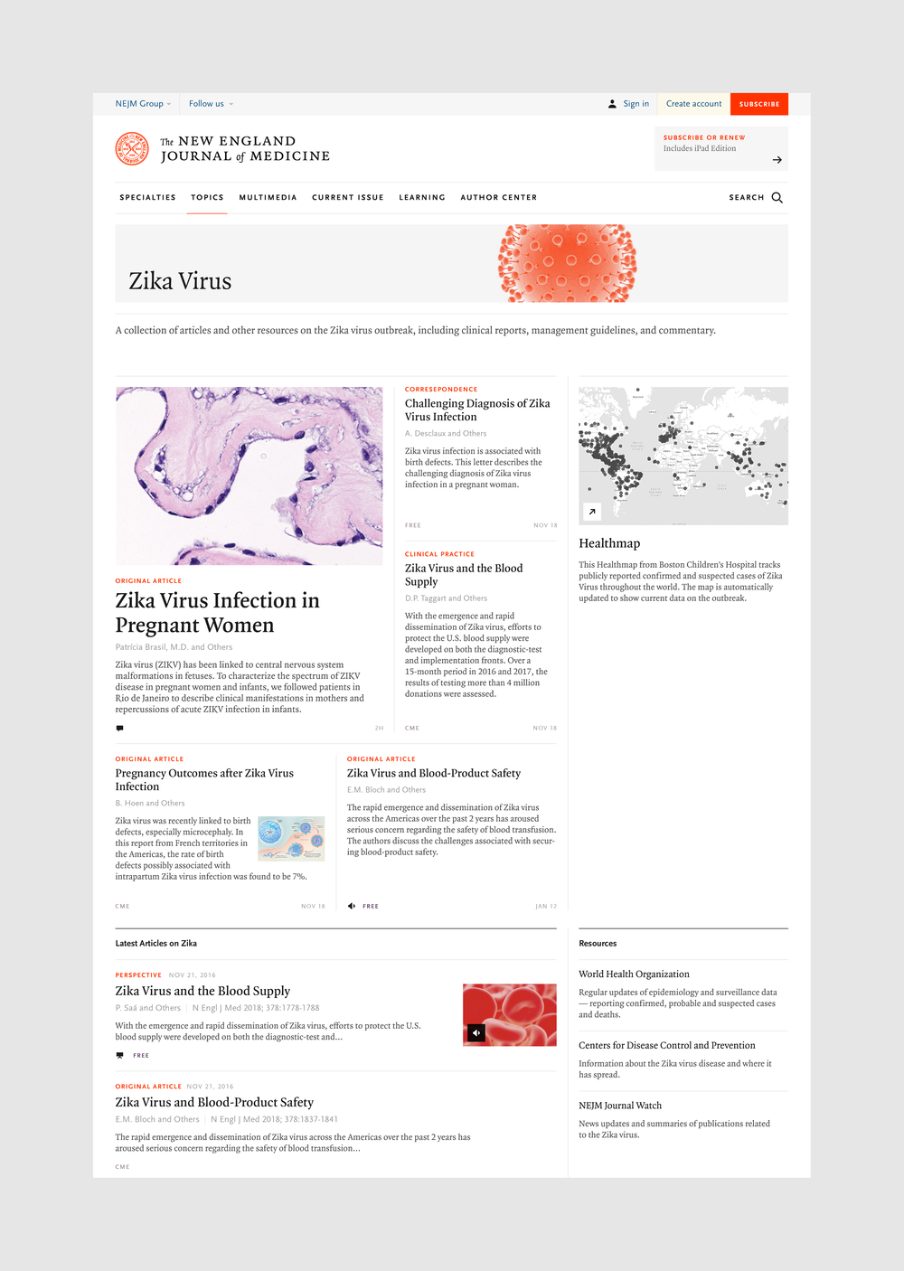
While designing for user behaviors centered on article pages, NEJM also wanted to grow the number of users that return to the site weekly. This meant a focus on intuitive navigation and landing pages oriented around the entry points users sought most.
Now, a medical resident might expand their knowledge by visiting the unified ‘Learning’ section for a 5-minute quiz or an extended study session, and a seasoned cardiologist might bookmark the Cardiology page for a feed of the latest breaking research. Easier still, search results now reflect this topical focus.
Mobile performance was given top priority. With so many user modes to consider, the design and front-end engineering needed to excel on any device, in any context. Light and fast interactions ensure physicians that need information in the field can find it quickly, with the same suite of tools available as on the desktop experience.
Together, these enhancements help users get more-than-ever from an inexhaustible base of medical knowledge. When physicians, students and other medical professionals need vital information, the new NEJM.org delivers.